

Introduction
For the second project, we were given the task of creating a 'Next Gen' game environment in the form of a digital diorama. While the last project targeted high end mobiles, this new project was targeted at current generation console and PC specifications. Even though current generation consoles and PCs still have quite a few limitations, it is thankfully nowhere near as many as mobile gaming, and so we were able to really push the boundaries in terms of geometry, texture sizes and visual effects. This gave us a lot more freedom to explore creative ideas, but also came with its fair share of issues and difficulties that needed solving.
This blog will explore some of the key assets of the final diorama, as well as some of the issues that arose throughout the process.

Part 1
TIMELINE


Part 2
art bible
Art Bible
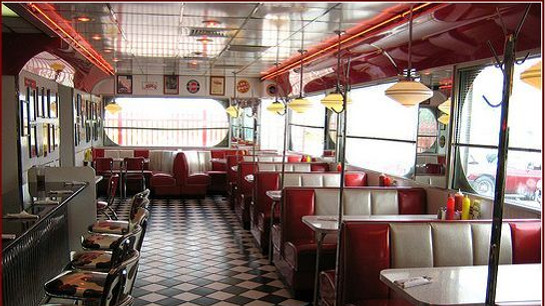
The initial task for this project was try to trim down the different concepts and ideas that accumulatedin my head, and distil them into a solid concept that I could work with. After much deliberation, I ultimately decided on designing and modelling a 1950s American diner scene.
I chose this idea for a number of key reasons. First and foremost, I really wanted to challenge myself. After enduring the first project, it became evident that the majority of issues arose within the lighting of my scene, and as a result I decided it was best to tackle this issue directly by creating another interior scene that would force me to examine lighting even further. In theory, this project would strengthen my understanding of lighting by forcing me to examine it in depth.
One aspect of the previous project that I was happy with, however, was my ability to make an asset look aged and distressed, so this time, to challenge myself even further I decided to eliminate the crutch of creating aged and destroyed textures and assets by designing and building a scene that is by its very nature very pristine, polished and reflective. I looked at hundreds of reference images, and tried to condense them down into an Art Bible, that I then assembled into the PDF viewable below. This document became a constant reference throughout the project and compelled me to stay on track.
The art bible specifically highlighted the types of asset that I would like to create for the project. It also contains a number of lighting examples to use as reference, as well as some architectural references that I would eventually implement into the project. I also studied the proportions and scales of a few of the key assets in the project, as that was another minor difficulty I had with the previous project. Finally, the last part of the art bible consists of a rough blockout, created in Maya, where I narrowed down the types of asset that I would create in the environment, and exactly where in the scene they would go.
Ultimately, the process of creating an art bible was incredibly beneficial in this project, as it helped me stay on track and understand what I had yet to do. Unfortunately however, I may have aimed slightly too high. I really underestimated the amount of time each asset in a next generation scene would take, and I eventually had to trim back some of the parts of the project. Specifically, I decided to scrap the idea of creating an exterior to the diner, as well as sacrificing one of the key interior assets - the jukebox. Both of these are things that I will definitely get to in the future, but would be impossible to do in this six week project.
 |  |  |  |  |  |  |
|---|---|---|---|---|---|---|
 |  |  |  |  |  |  |
 |  |  |  |  |  |  |
 |  |
Milkshake Mixer
Hero Item 1
After researching online, I decided on a few key items that were synonymous of a '50s diner, the first of which was this Hamilton Beach Milkshake Mixer. I really wanted to recreate this milkshake mixer in all its glory.
After researching on Google and Flickr I found a few images that were useful, but then I decided to check if I could see any second hand ones for sale with good images. I found the exact mixer I wanted to recreate on eBay, where the seller had photographed the machine from every possible angle and in really high resolution. One of them even had a ruler in it for scale, which was really useful.
Part 3
MODELLING & TEXTURING
Hero Items
Reference Images
 |  |  |  |  |
|---|
The introduction to smooth modelling in Maya was a really pivotal part of my modelling process in this entire project. While smooth modelling can be very high in resolution, it can be used to create really interesting and complex shapes really efficiently. The detail from this high resolution mesh can then be baked down to a lower resolution mesh, where the difference in geometry is faked via a normal map. Although I didn't know how to bake normal maps when modelling the milkshake mixer, I decided to create the high-poly version in Maya using smooth modelling, with the intention of painting and baking it at a later date.
The majority of this model was pretty easy to create thanks to the smooth modelling, but there were a few key areas where I had some serious difficulties. The base of the machine has very few sharp edges, and it has a really interesting and undulating form. As a result, creating the main body of the mixer itself was very difficult. After attempting to create it as one smoothed shape numerous times, I eventually decided to model it as two separate pieces. I then used a Boolean to combine the meshes and finally tidied up the intersecting geometry to give a really nice and clean blend between the two.

Object 1
Object 2
 |  |  |
|---|
After learning ZBrush in class, I then decided that bringing this asset into ZBrush would really help to add some realism to the object. I imported the object from Maya into ZBrush using the GoZ plugin, which exports the mesh to ZBrush without the need for .fbx or .obj formats. I found this method of importing much more efficient, as it was easier to keep track of my high and low resolution meshes without having to worry about another file.
Because this mesh wasn't really created with ZBrush in mind, some of the geometry was uneven and not created in quads (ZBrush tends to like quads more than triangles). This resulted in some really strange sculpting in ZBrush, where the indentations ended up really stretched and uneven. To combat this, I implemented a ZBrush technique we learned in class called Dynamesh. Dynamesh basically retopologises your mesh with evenly subdivided quads that are perfect for sculpting. This means that even a mesh that isn't specifically designed for ZBrush sculpting (like the mixer) can be easily readjusted to work in it.
I then started to use some of the ZBrush brushes to add some general wear and tear to the object, by knocking off corners using the Planar brush, and adding a warped metal effect using the Polish brushes.
The next phase of the ZBrush process was sculpting the Hamilton Beach logo on the top of the mixer. I tacked this issue by using a number of masks that I created in Photoshop [Fig 1.4, 1.5 and 1.6 below]. I created the masks as greyscale 2048x2048px images, using 16 bit depth. The reason I chose to use greyscale and 16 bit was because a 16 bit image has a lot more shades of grey, meaning the falloff could be much softer. I then created the alphas that I needed, and added a really subtle outer glow to the layers in Photoshop. The outer glow meant that they had a really subtle falloff, which gave a much softer extrusion in ZBrush. I then brought these alphas into ZBrush, and masked a selection using them. This selectionwas then extruded (or in some cases, carved in) using the inflate tool. The result is a really clear engraved logo on the top of the mixer [Fig 1.3 below].
Similarly, I used a series of alphas for modelling the screws. [Fig 1.2 Below]
 Fig 1.1 |  Fig 1.2 |  Fig 1.3 |  Fig 1.4 |  Fig 1.5 |  Fig 1.6 |
|---|
Instead of painting the textures in ZBrush or Photoshop, I decided to wait until we explored Substance Painter in class. I knew that Substance Painter would be the best software for the job as it allows us to paint a variety of different maps at the same time. I also did a test in class where I explored the best baker in class [link to blog], and decided that Knald was the best software for the job at the time.
So I baked the normals in Knald and then reimported the map into Substance Painter as the object's normal [Fig 1.12 below]. The result was pretty incredible, where all of the geometry was mimicked onto the low poly object via the normal. As the image below demonstrates, it is almost impossible to differentiate between the high poly ZBrush model and its baked counterpart.

Low Poly with Normal
High Poly
The next process I undertook was painting the material in Substance Painter. I chose to use Substance Painter as opposed to Photoshop or ZBrush for painting because of its physically based painting technique. This meant that creating subtle edge wear and detail was effortless, as well as being more accurate.
I started by creating a metal under layer, like the object would have in real life, and then added a paint layer with some height on top. I then used a generator to add some simple wear and tear to the edges of the surface [Fig 1.8] in an attempt to mimic reality. I found a number of benefits to using generators in Substance Painter, primarily the fact that they are easily reversed or altered if needed.
I then used the same alphas that I created for ZBrush as stencils in Substance Painter to paint the Hamilton Beach logo [Fig 1.9 below] . These textures were then exported for use in Unreal Engine. Unreal Engine supports Image Packing, which is basically combining multiple black and white textures into one RGB texture, thus saving on space. The maps I exported for this object were an RGB base colour, an RGB normal map (from Knald) and a single RGB with roughness, metalness and ambient occlusion packed into it. I then brought the low poly mixer into the blockout scene I created in Unreal Engine and applied the material.
 Fig 1.7 |  Fig 1.8 - General Wear |  Fig 1.9 - Hamilton Beach Logo |  Fig 1.10 |  Fig 1.11 |  Fig 1.12 - Normal Map |
|---|

Vending Machine
Hero Item 2
 |  |  |  |  |
|---|
The next key item that I wanted to recreate was an iconic Vendo Coca-Cola branded vending machine. After researching online it seemed to be a staple of most '50s diners to have a Vendo vending machine, and so it was a vital part of my scene.
Like with the milkshake mixer, the best place to find references for the vending machine was on eBay where someone documented what they were selling. References for this brand all varied slightly, but I used a combination of references to recreate it.
The process for creating this asset was very similar to that of the milkshake mixer. I now understood the way assets should be created for ZBrush (equally spaced quads) and implemented this in the creation of the vending machine. I modelled the basic shape in Maya using smooth modelling. Next, I brought the highest poly mesh that I created from Maya into ZBrush where I added some more basic wear and tear to the edges to give a more realistic and slightly aged look.
Because the vending machine didn't need to be opened, I decided there was no need to make the door a separate element. The money box on the front of the machine is a separate element however, that just interpenetrates the main body.
I again made some 16 bit greyscale alphas in Photoshop [Fig 2.5, 2.7 and 2.9] to use as masks in ZBrush. The "Coca-Cola in bottles" and "ice cold" embossed text were masked via the alphas I created, and then inflated. I did the same for the text on the coin box.
 Fig 2.1 |  Fig 2.2 |  Fig 2.3 |  Fig 2.3 - Ice Cold inflated |  Fig 2.4 - Ice Cold mask |  Fig 2.6 - Coca-Cola Inflated |  Fig 2.7 - Coca-Cola mask |
|---|---|---|---|---|---|---|
 Fig 2.8 - Coin Mask |
I then brought this mesh into Substance Painter for baking and painting. It was here that I encountered my first of many baking issues. While Substance Painter is primarily a 3D painting package, it also contains a really strong baker. What makes Substance Painter such a strong baker is it's ability to bake separate objects from high to low using a naming scheme. Traditionally, one would have to explode a mesh in Maya in order to eliminate baking errors, and then reassemble it afterwards. Substance Painter eliminates this step by baking objects with a name ending in "_high" onto an object ending in "_low" separately, and then recombining the entire object automatically. This is far more efficient and saves quite a lot of time.
While this works in theory, I encountered a number of issues when attempting to recreate this. The first few times I was baking from my "_high" to "_low", Substance Painter refused to bake any normal map at all. After a long time researching and testing, it turned out that ZBrush automatically renames your object when you export it, and therefore the name of the meshes I was baking were not the same and Substance Painter didn't know where to bake.
To combat this problem, I decided to bring the mesh into Maya to rename it, but the high poly mesh created in ZBrush was just too intense for Maya, and it would crash whenever I tried to import it. To counteract this issue, I decided to use Decimation Master in ZBrush to decimate the mesh. This creates a really low poly version of the mesh without losing very much detail, and this new decimated mesh could be loaded into Maya without issues. After renaming the meshes, I re-exported and attempted to bake in Substance Painter again, only to find a really strange discoball effect.

Traditional Baking using Exloding
Baking in Substance Painter using Naming

This was a really strange result that I wasn't expecting. After researching and testing again, it turned out that when you decimate a mesh in ZBrush it reorders the normals, but doesn't display the new normals. This just proved that I could bake from "_high" to "_low", but left me really struggling on how to get around this issue.
I tried to download a plugin for ZBrush that would rename the files correctly, but it didn't work, it produced the same issue as the first time.
Finally, after a very long time of testing, I discovered that Maya could not handle the really high mesh created in ZBrush, but it could, however, handle the individual elements on their own. Thus, I decided to re-export each individual object from ZBrush as its own .fbx file, and then import each of these into Maya separately, rename them all in Maya and then re-export them as a new .fbx. While this process was very lengthy and seemingly unnecessary, it was the only way I could do it successfully, and eventually I could bake in Substance Painter, and thankfully the result was worth it.
I then painted the mesh in Substance Painter in a similar way to the Milkshake Mixer. I used the alphas I used in ZBrush again to mask, and also created some new textures in Photoshop to use as Stamps on the sides, top and coin box. Finally I brought this asset into my blockout scene in Unreal Engine.
 Fig 2.9 - Substance Painter |  Fig 2.10 - CocaCola |  Fig 2.11 - Coin Stamp |  Fig 2.12 - Coke Bottle Stamp |  Fig 2.13 |  Fig 2.14 - In Unreal Engine |
|---|

 Fig 3.1 - Maya |  Fig 3.2 - Zbrush |  Fig 3.3 - Warping in Zbrush |  Fig 3.4 - Emissive in Substance |  Fig 3.5 - Unreal Engine |  Fig 3.6 - Unreal Engine |  Fig 3.5 - Emissive Material in UE4 |
|---|---|---|---|---|---|---|
 Fig 3.8 - Emissive Light in UE4 |
Ceiling Fan
Hero Item 3
Because lighting was so important to me, I felt it fitting to dedicate some time to the main lights of the scene. After researching online, this type of pendent lighting was very common in Diners in the 1950s.
Reference images were quite difficult to find for the lights, however, as they differ pretty greatly and don't have specific names. But after some time I found one image that was perfect, and decided to recreate it.
The modelling process for the ceiling fan was pretty simple because of the amount of repetition. I modelled the main frame, and then modelled one blade and duplicated it, rotating it 90 degrees each time [Fig 3.1 above]. Again using smooth modelling, I created a relatively high poly version, and then brought that high poly version into ZBrush [Fig 3.2 above]. I then subdivided the model quite a lot so that I had a lot of geometry to manipulate. I added the indentations on the motor, as well as creating a warping effect on the blades using the Polish brushes. This created a really interesting and realistic reflection on the surface. I also chamfered a couple of edges using the Planar brushes again, like with the milkshake mixer to simulate age and wear and tear.
Using the same naming method as previously discussed, I baked the high-poly ZBrush version onto the low-poly that I created in Maya. The only difference with painting this texture was that I wanted the light itself to be emissive, and so I had to add an emissive channel to my Substance Painter project. Then it was pretty simple, where I just painted the emissive colour onto the object in 3D [Fig 3.4 above].
I then brought the low poly object into Unreal engine as two separate objects - The bulb and the motor as one, and the blades as the other. I also centred the pivot of the blades so that they would freely rotate around the centre, meaning I could animate them easily in Unreal Engine.
Setting up the light in Unreal Engine was more difficult than I thought it would be. First I had to assemble the material in the material editor. The only difference here is that I had to plug the emissive texture into the Emissive Color tab. After putting the object in the scene I discovered that the emissive lighting alone wasn't enough, and so I decided to add a multiplier to the emission to weaken its effect slightly and then add a spot light below it, bluffing the result. This however, only simulated the light below the bulb, and so I added a point light below the bulb that would cast shadow upwards also. I made it so this light was Stationary however (unlike the Static spot light) so that the blades would cast a dynamic shadow on the ceiling.

Ceiling Light Actor
Spot Light (Down)
Point Light
I then changed the light in Unreal Engine so that it simulated a real life tungsten light bulb. I did this by forcing the light to use temperature in degrees Kelvin. I then changed the temperature according to a chart I found online (Link) to 3500K which gave it the warm glow of a tungsten light bulb.
Finally, to animate the fan blades I needed to add a blueprint in Unreal Engine 4. We didn't cover blueprint in class, but I followed a very simple tutorial online that demonstrated how to rotate the blades. Because I set the pivot in the correct place in Maya it meant the rotation was very simple to pull off as it just needed to rotate around the vertical axis.


Neon Coke Sign
Hero Item 4
The next key asset that I wanted to create was a neon sign. Like I stated previously, lighting was a huge driving force for this whole project, and one of the key lighting types depicted in my art bible was a variety of neon and fluorescent lighting.
Not only would these neon assets contribute to the overall lighting of the scene, but they are also iconic of the '50s diner period. After researching online, most diners had a neon sign from a commercial company. I decided to go with a really interesting Coca Cola light because I felt it would go well with the Coca Cola vending machine already created.
 |  |  |
|---|
I learned from most of the assets I already created that eBay was the best place to get multiple accurate photographs of the same object, and sure enough it also worked for the neon Coca-Cola sign I wanted to reproduce.
The sign itself is made of a simple reflective back surface, and neon tube lettering. I decided to bring the first image of the sign into Maya as a free image plane, and I then drew over the neon tubes using the curve tools in the front view. I drew the entire Coca Cola sign, and half of the rest of the sign that I would then mirror later.
I then created a circle, using Maya's curve tools, and used the Surfaces>Extrude function to sweep the circle along the path. I made sure to select Polygon extrusion rather than NURBS, because we only use Polygon surfaces in engine and this would save me having to convert it later. This created a really nice effect, but the surfaces of some of the extrusions was reversed, displaying in this black colour.
This was obviously very easy to fix, I just had to reverse the normals on the black surfaces so they were facing out. The next issue I faced, however, was that the geometry itself was really dense in polygons (13,000 triangles), and the asset was way too expensive for a small light in the scene. To deal with this, I decided to use the Polygon Reduce tool in Maya, which is an automatic polygon reduction tool. Luckily, the polygon reduce function produced a relatively nice result, reducing it down to roughly 4,000 polygons while still keeping its shape. It did however result in some nasty geometry that I had to clean up afterwards.
Because I knew this texture was going to be quite emissive, however, I decided that I could get away with some sharp edges and low resolution on the tubes as the emission would hide quite a lot of the imperfections.
So I then brought this object straight from Maya into Substance Painter to texture it. I decided it wasn't necessary to bring this asset into ZBrush as it would not benefit from it very much. Instead, I just went straight into adding my materials in Substance Painter. Like for the bulb of my ceiling light, I had to add an emissive channel to Substance Painter to allow myself to paint emission. Like for the vending machine, I created a texture in Photoshop that I then stamped onto the back plate of the neon sign [Fig 4.3 below]. Because the Coca-Cola font was created with thickness, the stamp brush kept rotating to match the surface of the tubes, and so I found it significantly easier to paint the stamp that I created in the 2D view in Substance Painter.
Finally, I brought the low poly mesh and the four textures I created in Substance Painter (I again packed my textures -Base Colour [RGB], Normal [RGB], Roughness [R], Ambient Occlusion [G], Metalness[B] and Emission [RGB]) and created a material for the light in Unreal Engine. In class we learned how to apply Frac and Sine nodes in the material editor to create a seemingly random blinking effect to a point light. I then extrapolated this effect by applying the same nodes to the material of the neon light, and multiplying the result by the emissive colour [Fig 4.5 below]. This meant that the emission would pulse and glow. This was a great effect, but the result is slightly too harsh and jarring for a real neon flicker, but I have placed the effect here as a placeholder until we study blueprints in class.
While the result of the emissive texture was quite convincing, the emission didn’t really effect the objects around it in a believable way. To combat this, I added a point light to just above the surface of the light in Unreal Engine. I then duplicated my emissive material and turned it into a light function in the material editor. I then applied this light function to the light bulb, which resulted in the light bulb glowing in the same way that the neon sign did. This point light now interacted in a much more believable way than just the emissive texture alone, but it also casted a strange shadow on the wall behind the neon light. To solve this issue I simply disabled the point light's ability to cast any shadows, which gave the most accurate result.
While I am relatively happy with the result, there are a few things I would do differently if I was to do this again. I would definitely try to create a believable result using much less geometry by creating the emission using only texture and no curved geometry. I did this for the exterior sign which works from a far distance, but would probably not work very well up close. I would also have tested projecting the emission onto the mesh itself.


 Fig 4.3 - Sign stamp |  Fig 4.4 - Substance emission |  Fig 4.5 - Frac | Sine |
|---|
Table Jukebox
Hero Item 5
The next hero asset that I decided to model was this Seeburg Table Jukebox. Because of time restrictions, I decided to postpone modelling the full-size jukebox, so the need for creating a good quality table jukebox increased.
Again, like most of my assets to this stage, the best place for reference was eBay, where I found the exact model I wanted to recreate for sale.
 |  |  |  |  |  |  |
|---|---|---|---|---|---|---|
 |


I started by modelling this asset in Maya in the same way as the other assets. Like with the milkshake mixer, I found it was easier to model the main body of the table jukebox out of multiple pieces and then tidy the joining geometry. This asset was one object that has quite a lot of small detail, like the grooves on the coin slot, as well as the circular path on the top for changing pages, and I decided to push normal maps as far as I could here, by only using normal maps to create these details.
To do this, I brought the high poly mesh from Maya into Zbrush where I did the normal wear and tear that I did to every asset so far, but I really embraced sculpting for this model. I created an alpha to use as a mask in Photoshop again, but the majority of the rest of the indentations were sculpted using all of ZBrush's powerful sculpting tools. I also dynameshed this mesh as it was the easiest was to get the detail I needed.
One part of this object in particular that I felt it was important to add some wear and tear was the number pad [Fig 5.4 below]. Because these keys are used so regularly they tend to get damaged a little, and so I wore the edges of the number keys down in ZBrush using the Planar and Smooth brushes. I then noticed from my references that the numbers tend to sit imperfectly in their frame, and are often crooked and pressed in slightly. To recreate this interesting occurrence I used the Transpose tool in Zbrush. I basically masked each key individually because they were all one mesh, and then distorted the selection using the Move and Rotate functions in the Transpose tool. This gave a pretty convincing result of age to the keys.
 Fig 5.1 - Low Poly in Maya |  Fig 5.1 - Alpha created in Photoshop |  Fig 5.3 - Zbrush |  Fig 5.4 - Number pad |  Fig 5.5 - Coin Slot |  screen-shot-2016-03-03-at-23-47-37 |
|---|
I then brought the low poly mesh into Substance Painter where I baked the normals using the "_high" "_low" discussed previously. The main material of this asset was metal, so I first added a base metal layer. I then added an Opacity channel to the project so that I could paint opacity for the glass material. I created a variety of stamps and stencils in Photoshop and Illustrator to create the stickers and numbers on the model. I tried to locate a good quality image of the Seebrug Wall-o-matic logo online, but couldn't find anything even remotely accurate to the reference imagery, so I decided to recreate it myself in Illustrator [Fig 5.9 below].
 Numbers alpha for number pad |  Seeburg logo recreated |
|---|---|
 Inner Pages |  Coin Slot stamp |
I then brought this asset into Unreal Engine to test the material. The result I got was really strange, where the metalness was just not working, and the result was a really inaccurate representation of the material I created in Substance Painter. I took some time to examine exactly why this was happening, and eventually discovered that I was having an issue with having transparency and metal in the same map. After some research it became clear that this was an issue associated with using differed rendering, which Unreal Engine does by default. Deferred rendering has issues sorting transparency orders. Rather than completely change my scheme to a forward rendering type, I decided it was simpler to just assign two separate materials to my original mesh in Maya. This luckily didn't affect my UVs or my texturing in any way so it was a relatively easy fix.
I then decided that having two unique materials for this relatively small asset was very inefficient, and so I decided to remove the glass material with the Seeburg logo from the scene entirely, and instead created a general glass material that I applied to every glass asset in the scene. This was clearly more efficient for in game.
After placing the asset in Unreal Engine [Fig 5.11 below] I decided that the object itself would probably emit light, so I placed a point light within the glass face. However, if I was to go back and edit this now I think it could also benefit from an emissive texture inside where the track list is as I think it would really add to the overall lighting in the scene.
 Fig 5.7 - Substance Painter |  Fig 5.8 - Coin slot |  Fig 5.9 - Seeburg logo on glass |  Fig 5.10 - Number Pad |  Fig 5.11 - Light in Unreal |
|---|


Part 3
MODELLING & TEXTURING
Secondary Items
Bar Stool
Secondary Item 1

Both the low poly and a high poly were modelled in Maya using smooth mesh modleling.

The High Poly was then brought into ZBrush to add shape and wear and tear.

I had modelled this folded metal piece underneath the cushion in Maya, but after examining normal maps more I think I could have modelled it flat and used a normal map to add the detail.
Both the low poly and a high poly were modelled in Maya using smooth mesh modleling.
Fridge
Secondary Item 2

I created a 16bit Greyscale alpha map to bring into Zbrush. The alpha has a really feathered edge in order to get a soft falloff in ZBrush. I used this alpha to mask a selection that I then inflated out of the door of the freezer.

In a similar way to all of the other alphas I created in Photoshop, I created this alpha to mask in Zbrush. I then inflated the selection inwards to get the indentations around the fridge handles.
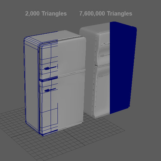
The resulting retopoly in Maya is only 2,000 triangles, in comparison to the 7,600,000 triangle high-poly mesh.
I created a 16bit Greyscale alpha map to bring into Zbrush. The alpha has a really feathered edge in order to get a soft falloff in ZBrush. I used this alpha to mask a selection that I then inflated out of the door of the freezer.
Cooker
Secondary Item 3

Unlike the previous assets where I could find good reference images on eBay, I found it incredibly difficult to find relevant reference imagery for the kitchen assets of a 1950s diner. I found this image of a chef in a diner kitchen on someone's online travel blog.

Because I could only find one relevant reference image for the cooker, I decided to do a quick sketch to determine the parts of the cooker that were not visible in the reference photograph.

Unlike the previous assets where I could find good reference images on eBay, I found it incredibly difficult to find relevant reference imagery for the kitchen assets of a 1950s diner. I found this image of a chef in a diner kitchen on someone's online travel blog.
Booth
Secondary Item 4

Another asset that was very iconic of a '50s diner was the booths. Similarly to the previous assets, I modelled the main low and high poly assets in Maya.

I then brought the high poly mesh into ZBrush where I could add all of the detail it needed.

While the results of this object are relatively convincing, there are some things that I would change if given the opportunity. Firstly, the surface of the chair seems too shiny, particularly when coupled with the lighting style of my scene. I would also examine modelling the indentations of the cushions via geometry, but this could potentially be too expensive.
Another asset that was very iconic of a '50s diner was the booths. Similarly to the previous assets, I modelled the main low and high poly assets in Maya.
Coffee Machine
Secondary Item 5

I modelled the coffee machine in Maya using a very similar technique to the previous assets.

I chose to paint this asset in Substance Painter.

I again used a masked created in Photoshop to add detail to the top of the coffee machine.
I modelled the coffee machine in Maya using a very similar technique to the previous assets.
Part 3
MODELLING & TEXTURING
Set Dressing
The brief requested that we make our dioramas "feel alive, perhaps through changes in lighting or objects moving when buttons are pressed for example". While I had already implemented changes in lighting via the pulsing neon CocaCola sign, and I also had the ceiling fans propelling gently, I felt like the best was to make an environment "feel alive" was with the use of set dressing.
Like on a film or stage set, game artists can use set dressing techniques to breath life into a scene, and add the illusion of use. This is something that I have always been very interested in, and decided to implement it into this scene to give the space another level of realism. I did this by scattering some very specifically designed asset generously around the scene to simulate the use of the space. I modelled knives and forks, and placed them very deliberately in different positions at each place on the table. I lay the menus on the tables and countertops as if they had just been read. I rotated objects so that they weren't all perpendicular.
While this effect really does add to a scene, I found out pretty quickly that adding multiples of these assets seriously added to the vertex count of the scene, even with low poly assets. For example the plates that I modelled are relatively low poly, but when you combine them into a stack the number of polygons used reaches unjustifiable heights. In an attempt to combat this, I modelled a stack of plates separately, and deleted the unseen faces. That said, I still feel the number of polygons I used was too much considering they are never the centre of attention in the scene, and I feel like if I had more time I could create a stack using a normal map that would significantly reduce the number of polygons used in these areas.
Below is a few of the set dressing assets and how I lay them out in my scene.
[Click the images for more info]
 |  |  |  |  |  |  |
|---|---|---|---|---|---|---|
 |  |  |  |  |
Part 3
MODELLING & TEXTURING
Architecture

Ceiling + Walls
Attempt 1
After modelling some of the assets that were going into the scene, I decided the next logical step was to model the architectural elements that would make up the diner interior.
After researching online, I discovered that most of the diners in the 1950s were made with highly reflective pliable material that would be warped and bent into shape. This warping created some really interesting reflections that I wanted to try and recreate.
I started by modelling the walls and ceiling in Maya. I brought them into ZBrush where I used a similar technique as before to warp the surface using the Polish brushes. Finally I brought them into Substance Painter and then Unreal Engine.
While the walls and ceiling I created matched the references pretty well, and created the interesting reflection I wanted, I had a few major issues with them. Firstly, where the ceiling met the walls seemed a bit unrealistic. Secondly I didn't think the style of architecture matched the style of interior I was going for.
After discovering this, I decided to go back and look at some more reference imagery of the interiors of 1950s diner to try and solve this issue. After this research I decided to change my approach to the ceiling slightly, and to fine-tune my design for the walls.

 Fig 12.1 - Maya |  Fig 12.2 - ZBrush |  Fig 12.3 - Substance Painter |  Fig 12.4 - The edge pieces |  Fig 12.5 - Unreal Engine |  Fig 12.6 - Unreal Engine |  Fig 12.7 - Ceiling Reflections |
|---|
Ceiling
Attempt 2
I looked at a diner in Fargo, North Dakota called Kroll's Diner for some reference. Like in my original attempt, the walls and ceiling of this diner used a similar pliable reflective wall and ceiling, but the style matched my diner much better.
Unlike my original reference, however, the ceiling tiles in Kroll's were much smaller. At first I considered modelling a section of 4x4 tiles and duplicating them but I feared the repetition would show.
Instead, however I decided to model the four different ceiling tiles separately and assemble them in different orders in Unreal Engine in an attempt to break up any repetition.
I created a variation of 4 tiles. Three of the tiles consisted of only slight warping variations, while the fourth had a ceiling cent.
When I brought these 4 tiles into Unreal engine, I tried to create a random array of tiles by placing different tiles beside each other, and rotating some of them 90 degrees. While the result of all this effort might not be noticeable at first glance, I think it adds to the overall realism of the scene.

 Fig 13.1 - Ceiling Tiles in Maya |  Fig 13.2 - Ceiling Variation in UE4 |  Fig 13.3 - Ceiling Variation Closeup |  Fig 13.4 - Ceiling |
|---|
Walls + Windows
Attempt 2
I also used Kroll's Diner as reference for the walls and windows of the diner.
The walls were made of a very similar reflective surface as the ceilings, but they had a curved trim around the top that broke up its connection with the ceiling. On this trim was a neon light that circled the entire restaurant that I felt would add to the lighting of my scene nicely.
The windows were also really interesting as they were rounded at the edges.

 Fig 14.1 - Wall modelled in Maya |  Fig 14.2 - Wall textured in Substanc |  Fig 14.3 |  Fig 14.4 - Windows and Doors |  Fig 14.5 - Kitchen Reference |  Fig 14.6 - Kitchen Wall |
|---|
Part 4
lighting
Emissive
Lighting part 1
As stated previously, lighting was a really important part of my diorama. I wanted the scene to be almost entirely artificially lit, where the majority of the lighting came from fluorescent neon tube lighting. Hence, I decided to first light the scene using only emissive lighting to examine just how much I could do with emission before having to use traditional point and spotlights.
After assembling a few of the emissive elements in the scene I soon realised that emission alone was never going to be enough to light the entire scene. Even when I multiplied the emissive materials up to incredibly high figures, the effect was not what I was expecting, or needed it to be. Instead of lighting the environment, the emission just blew-out all of the detail in the model itself and didn't light the surroundings very well.

There is an option in Unreal Engine where you can enable “Light as if Static” as well as “Use Emissive for Static Lighting” where it attempts to solve this issue. The result of these options was definitely much better, where the light emitted interacts with the scene a bit more, but the colour is still overly blown-out and misdirected.

It was clear that emissive lighting just wasn't going to be enough to light the entire scene on its own, and I would need to implement spot and point light to shape the lighting in the way I wanted. As a result of this realisation I decided to lower the intensity of the emissive textures, and scatter a series of point and spot lights throughout the scene to fill any shadow gaps. These lights typically didn't cast any shadow, and mimicked the colour of the surrounding lights in an attempt to simulate their effect. The slider below shows the result of emissive lighting alone beside an image of emission coupled with point and spot lights. The result of using point and spot lights to light the scene, and using emission to give a subtle glow to the lights was much more convincing, and gave a much more accurate result.

Part 5
Conclusion
The main aim of this project was to take all of the lessons I learned in the first project, as well as all of the new operations taught in class, and apply them to a PC or Console quality diorama. While in the previous project we were heavily restricted by the target hardware, this project was much more free and allowed us to dedicate far more time on the creative process, without worrying about the technical aspects as much.
The process of modelling for these higher end platforms was not as easy as I first expected. The introduction of smooth modelling, as well as sculpting in ZBrush created really high resolution geometry, which then subsequently introduced the need for baking detail from high to low poly. The introduction of Substance Painter, however, helped to expedite the texturing process while giving more accurate results.
In hindsight, there were quite a few aspects of the finished scene where I feel I did not excel. The first aspect I know I could improve on is the lighting of the scene. One of the aims I set out for myself in this project was to improve on lighting, which I definitely did. The lighting of this scene is much better than of the previous project, but it still needs some manipulating to get right. This is something that I will again focus on in the next project in order to feel fully comfortable lighting an environment.
After completion of the project it is also evident that I aimed slightly too high. I originally wanted to also model the exterior of the diner, as well as some more internal assets, but in retrospect that would have been impossible. In fact, some of the assets I modelled for this scene were rushed as a result of timing issues.
I set out to challenge myself as much as I possibly could with this project, in terms of lighting, modelling and scheduling, and I am overall quite happy with the final result.
 |  |  |  |
|---|
Part 6
Addendum
Week 7 Day 3 - Intro to Smooth Modelling - https://georgeokeeffegameart.wordpress.com/2016/02/17/week-7-day-3-into-to-smooth-modelling/
Week 7 Day 4 -Modelling for the Sony Brief - https://georgeokeeffegameart.wordpress.com/2016/02/18/week-7-day-4-sony-brief-modelling/
Week 7 Day 5 - Baking Floaters - https://georgeokeeffegameart.wordpress.com/2016/02/21/week-7-day-5-baking-floaters-photogrammetr/
Week 8 Day 1 - Baking in xNormal - https://georgeokeeffegameart.wordpress.com/2016/02/22/week-8-day-1-baking-xnormals/
Week 8 Day 2 - Santa Baking Test - https://georgeokeeffegameart.wordpress.com/2016/02/23/week-8-day-2-normal-hunt/
Week 8 Day 3 - Intro to Unreal and VFX Festival - https://georgeokeeffegameart.wordpress.com/2016/02/24/week-8-day-3-unreal-and-vfx-festival/
Week 8 Day 4 - Intro to ZBrush and VFX Festival - https://georgeokeeffegameart.wordpress.com/2016/02/26/week-8-day-4-intro-to-zbrush-vfx-day-2/
Week 8 Day 5 - Maya to ZBrush + Milkshake Mixer - https://georgeokeeffegameart.wordpress.com/2016/02/28/week-8-day-5-maya-to-zbrush/
Week 9 Day 1 - Creating Alphas for ZBrush - https://georgeokeeffegameart.wordpress.com/2016/02/29/week-9-day-1-creating-alphas-for-zbrush/
Week 9 Day 2 - ZBrush Tree - https://georgeokeeffegameart.wordpress.com/2016/03/01/week-9-day-2-zbrush-tree/
Week 9 Day 3+4- Retopo in ZBrush - https://georgeokeeffegameart.wordpress.com/2016/03/03/week-9-day-34-retopo-in-zbrush/
Week 9 Day 5 - Intro to Substance Painter - https://georgeokeeffegameart.wordpress.com/2016/03/06/week-9-day-5-intro-to-substance-painter/
Week 10 Day 1 - Baking in Substance Painter - https://georgeokeeffegameart.wordpress.com/2016/03/12/week-10-day-1-baking-in-substance-painter/
Week 10 Day 2 - 5 - Emission in Substance and Unreal - https://georgeokeeffegameart.wordpress.com/2016/03/12/week-10-day-2-to-4-emission-in-substance/
Week 10 Day 5 - Intro to Lighting - https://georgeokeeffegameart.wordpress.com/2016/03/14/week-10-day-1-intro-to-lighting/
Week 11 Day 1 - Advanced Lighting - https://georgeokeeffegameart.wordpress.com/2016/03/14/week-11-day-1-advanced-lighting-in-ue4/
Week 11 Day 2 - Colours and Lighting in UE - https://georgeokeeffegameart.wordpress.com/2016/03/15/week-11-day-2-colours-and-lighting-in-ue4/
Week 11 Day 3 - Material Instances -https://georgeokeeffegameart.wordpress.com/2016/03/16/week-11-day-3-materials-and-material-instances/
Week 11 Day 4 - Dynamic Materials - https://georgeokeeffegameart.wordpress.com/2016/03/17/week-11-day-4-dynamic-materials/
Week 11 Day 5 - Vertex Painting - https://georgeokeeffegameart.wordpress.com/2016/03/21/week-11-day-5-vertex-painting/
Week 12 Day 1 - Project Day - https://georgeokeeffegameart.wordpress.com/2016/03/21/week-12-day-1-project-day/
Week 12 Day 2 - Landscape & Terrain - https://georgeokeeffegameart.wordpress.com/2016/03/22/week-11-day-2-landscapes-terrain/
Week 12 Day 3 - Project work
Week 12 Day 4 - Project work
Week 12 Day 5 - Project work