
Walls
Evolution

Evolution
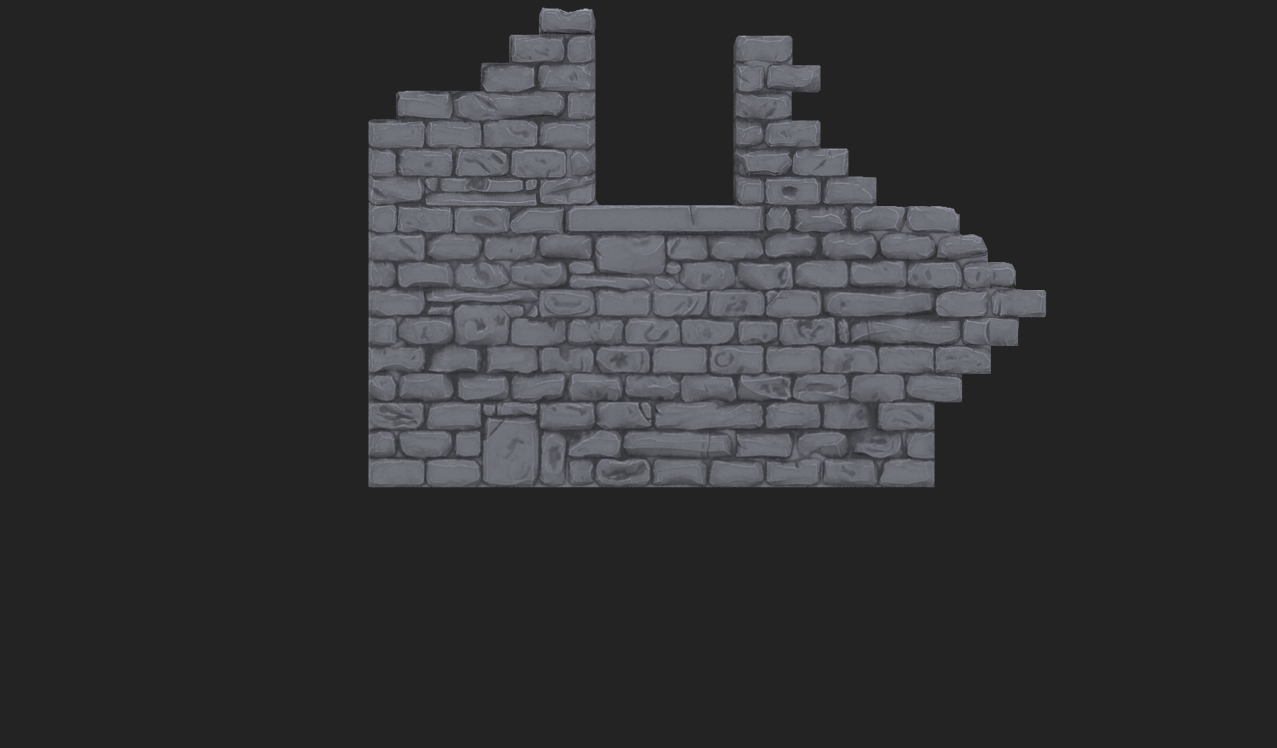
While modelling the walls sounded simple at first, in reality it was much more complicated than I ever could have imagined. I went through so many different iterations and variations trying to get the correct result. Above is an image of just some of the walls I created and assembled in Unreal Engine. I faced a huge number of interesting issues throughout the process, and I came up with some compelling solutions to these issues.
The Issue


The Issue
I originally set out with the intention of creating a really optimised and efficient texture for the walls. Typically, the best way to accomplish this is to create a tiling texture. As you can see from the images above, this tiling texture approach works very well for a flat wall, but what happens when this texture needs to be demolished in a number of different places? As the texture is tiling, it does not have depth information for the tops of these bricks, and so the illusion is broken. I decided to attempt solving this issue in a number of different ways, which are all discussed below.
Attempt 1
In an attempt to solve the issues revolving tiling textures, I decided to model and sculpt the majority of the first wall, and to re-use parts of this wall to create the rest of the scene.
Tiling Approach
The aim was to model the top portion of this wall, and to re-use what I had modelled to create the base of the wall as well as. This entire portion of wall could then be mirrored on the back to create the other side. Modelling and sculpting this wall was largely straightforward, the main issue arose when trying to re-use this texture again on all of the other walls in the scene. And so I devised the approach below.
Maya

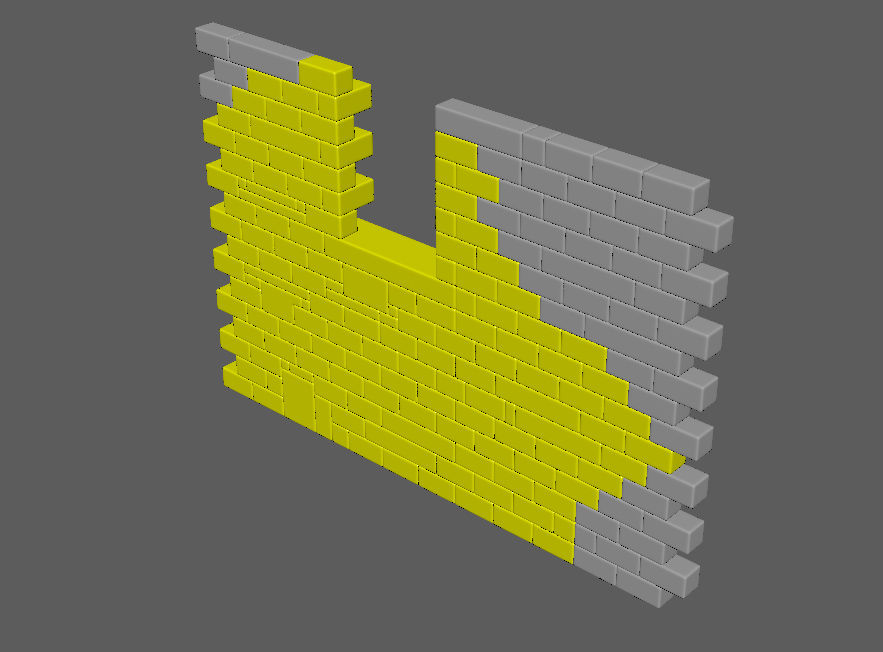

I wanted to create one section of wall that would contain all of the information for every wall in the scene. This meant creating a very specific section of wall that looked normal as a whole, but that could also be destructed to match the other walls in the scene correctly. After a lot of iteration, I created the wall above which as a whole contained the parts to make up every wall in the scene.
Sculpted in ZBrush


To add detail to these bricks, I decided to take the combined wall that I had just created into ZBrush, where I used a variety of techniques (discussed later) to chamfer and damage the edges of the bricks, to simulate wear-and-tear.
Baked onto flat tops


Finally, to create the low poly meshes, I simply exported the desired walls from ZBrush, and created a low poly mesh that would wrap over the top of these walls. This new mesh gave me the UV space to bake the top of these walls, thus solving the original depth issue. Every mesh could now use the tiling texture for the front, while having their own specific top that was baked and assembled separately.
Result in Unreal Engine


This attempt, although incredibly complicated and difficult, actually worked out quite well, at least from a distance. I intentionally tried to make these walls as optimum as possible, and all of the walls in the scene share just one material, even though they are all incredibly different. While the tiling texture is applied to the flat faces on the front and back of the meshes, a new unique portion of the texture is applied to the strip on the top of each mesh. There are, however, a few obvious errors with this approach.
Errors

The first, and most prominent issue with this method is that each mesh has a lot of seam errors. Because the new flat tops don't sit exactly on the bricks in each case, I received a very ugly baking error. This could be solved by simply adding more resolution to the top mesh, so that it sat more accurately on the high poly sculp.
The second issue is that the mirroring of the mesh is incredibly obvious, and looks poor. I originally thought the mirroring of the mesh on the other side would not be too obvious as you would never see both sides of the wall at the same time, but I forgot to take into account the demolished boarders of the walls. You do, in fact, see both sides of the wall at the perimeter of the wall, and the repetition is very obvious. I attempted to mask this by scattering loose bricks on the wall, but it was less than optimal and didn't fit in aesthetically.
Finally, the silhouette of the wall is incredibly sharp, and looks far too clean. This can, again, be solved by simply adding more resolution to the mesh.
While this approach worked pretty well, the result really wasn't worth the effort, so I decided to start a new approach, one that was very similar, but aimed to solve the issues that arose with this method.
Attempt 2

The second approach was very similar to the first, but revolved around adding more resolution to the silhouette of the walls to eliminate any ugly seams and sharp edges, as well as minimising the appearance of mirroring around the edges.

To do this, I simply went back to the same ZBrush file as before, and duplicated the top layer of bricks for each wall, and pulled them away from the original wall. I then resculpted some extra detail into these pieces to give a bit more variation to each.

Then I simply decimated the top layer of bricks individually, and UVed them. Unlike the first approach, this approach was a bit less optimised, and to make space for the new faces I had to spread the UVs out over two materials instead of one. The tiling texture shared a material with three of the wall-tops, while the other tops shared their own material.

This meant that some walls used only one material in Unreal Engine, while others used two.


While this approach might not be as optimised and efficient as the first approach, it definitely makes up for that as the silhouette is much more interesting and the repetition is much less obvious. Below is an assembly of all of these walls in the scene, just before we sent it off to Rare for their feedback.


Errors
Even before I sent these walls to Rare for their feedback I had a number of issues with them myself.
The first major error that I noticed was that I forgot to bake the mortar between the bricks in this attempt, which gives the impression of really flat and square bricks. This was obviously unintentional. Solving this issue would be quite simple, by re-introducing the mortar and protruding and eroding it in various areas on the tiling wall texture.

Without Mortar
With Mortar
Secondly, the repetition of the tiling texture in the walls is a little too obvious, and the benefits of using a repeating texture started to become overshadowed by the ugly repetition. I tried to hide this repetition as much as possible by sticking loose bricks to cover the areas where the tiling was most obvious (as shown below), but this is obviously less than ideal.

Rare also noted in their feedback that the bricks were a bit too small when compared to the characer. They also mentioned that they wanted the wall to be one stone in depth (as opposed to the two that I had created). I consciously decided to do two bricks deep originally as the concept artwork suggested it, but I definitely agree that one brick thick, with larger and more irregular shaped stones would add more to the overall style of the environment.
Errors
Attempt 3

Taking into account all of the issues that I encountered over the past few attempts at creating the wall, as well as the feedback from Rare, I decided to resculpt the walls from scratch again.
After speaking with Darren at Rare, he recommended that I not continue trying to create a tiling texture, and instead just sculpt each wall individually. He did, however suggest being as clever as possible, and re-use textures where possible instead of in every situation.
While I learned a lot of valuable and interesting skills by creating tiling walls, they really weren't worth the amount of hassle. The repetitions were too obvious, the baking produced too many errors, and they really didn't match the aesthetic of the concept artwork. And so I decided to tackle the issue again, but from a different perspective.


In an attempt to solve all of the issues I had encountered, I decided to go back to basics, and remodel and sculpt some new test walls from scratch that would re-introduce all of the aspects I wanted to incorporate. I wanted these walls to still be efficient in terms of texture space, but I was now happy to dedicate one whole material to each wall section. I wanted the stones to be more irregular, and less like bricks. The size of the stones should be larger, and feel more organic. And finally, the walls should be only one brick deep.

This approach meant it was much easier to keep a similar size and style among the various walls, while also making it much quicker to assemble, as well as the end result appearing much more irregular and natural.
To give the suggestion of a rugged and undulating wall I decided to merge every sub-tool in ZBrush, and dynamesh the entire wall to delete any inside faces. This combined mesh could then be decimated to a really low number thus creating undulating resolution throughout the wall, while still keeping the geometry usable in game.
Keeping a Clean Silhouette
The above approach worked incredibly well for adding detail to the body of the wall, but certain parts of the meshes really suffered as a result. While decimating the wall, the silhouette became really sharp and choppy, as the resolution was being evenly distributed throughout the model. And so, I devised a subtly new approach to maintain manageable resolution along the front faces of the wall, while maximising the resolution around the silhouette.


The first thing I did was assemble the wall in ZBrush, like I was doing all along and exported this mesh as the high resolution

I then merged all the sub tools, and dynameshed the entire thing with a high resolution to keep the shape as much as possible, but remove all of the inside faces.I found this the fastest and best looking way of removing unwanted faces.

I then tried a similar approach in ZBrush using masking and redecimating, which gave very similar results.
The first thing I did was assemble the wall in ZBrush, like I was doing all along and exported this mesh as the high resolution

Success
This approach was definitely the best by far:
1 - The silhouette is much higher in resolution while the overall resolution is still quite low.
2 - The overall shape is much more interesting and less flat.
3 - The mirroring and repetition is much less obvious, as the front is repeated on the back only and you can never see both sides at the same time.
4 - The rocks are much more organic in shape, and less brick-shaped.
5 - The size of the bricks matches the character better.
6 - The inclusion of mortar adds even more variation to the mesh.
7 - There are much fewer seam and baking errors, although there are still too many.
What I Would Change
With that said, there are still a number of ways in which these meshes could be improved.
The first issue I would love to correct given the time would be the junction between the top of the wall and the main wall texture. The front of the wall is being repeated on the reverse in an attempt to optimise texture space, but where this repeating texture meets the top still has a really ugly seam, as seen below.
This only appears on the back faces of the wall, so it is not very noticable in game, but there nonetheless.

Secondly, the geometry at this junction is rather unclean and wasteful (as seen below). If I had more time I could definitely clean up this junction, which would not only optimise the mesh, but could also solve the above issue of an ugly seam (or at the very least, mask it significantly more).

The last issue I have with these walls is that in some areas, you can still see repetition of geometry, as shown below. Luckily, however, I was able to limit these to the external faces of the geometry so that it is not visible in game.

